The Landing Page Analyzer - Unbounce

BEFORE START
I was invited to be the Lead Designer in this awesome Marketing Utility tool project. That basically creates easy-to-use free marketing tools to be part of our top-of-funnel strategy to generate leads.
My role was to conduct all the UX/UI processes integrating a small team of 4 (me as a designer, copywriter, developer, and marketing strategist)
Objective: Analyze our existing marketing tools and find opportunities to create new effective ones to attract leads.
Challenge: Create high-quality interactive tools with limited time and resources.
Phase 1- Brainstorm session to find new opportunities
8 Participants | 37 fresh ideas
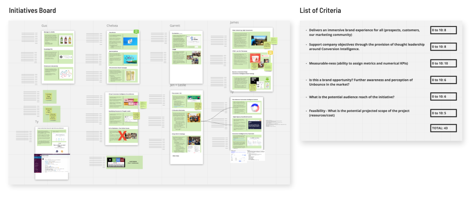
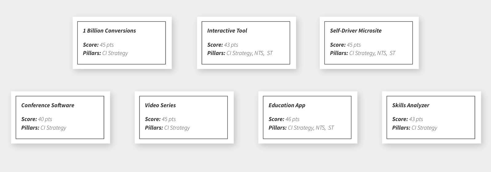
After the brainstorming, we've carefully filtered the best ideas
Phase 2 - Existent tools analysis
We've made the brainstorming session to find new ideas, but we also looked at the most successful tools we've developed in the past.
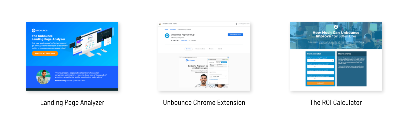
Selected Concept/tool - The Landing page Analyzer
The LPA is an online report that provides useful insights about your landing page. With our insights, you can optimize your page and increase your conversions.
Fun fact: This forgotten page/tool built in 2017 is not just bringing huge traffic to our page every day but it’s the second most visited page in our marketing strategy and it’s all organic!
Problem: The database and branding of this tool were outdated. A lot of insights provided don’t make sense anymore and we might influence marketers to make the wrong choices.
Opportunity: Change the old database to our new ML/AI-powered Conversions Benchmark Report, refresh the branding and increase the reach of the page.
🏆 Considering the limited resources and the high positive impact, we decided to refresh the Landing Page Analyzer in the first phase of the project.
🏆 Considering the limited resources and the high positive impact, we decided to refresh the Landing Page Analyzer in the first phase of the project.
Research - Interviews / User testing(old page)
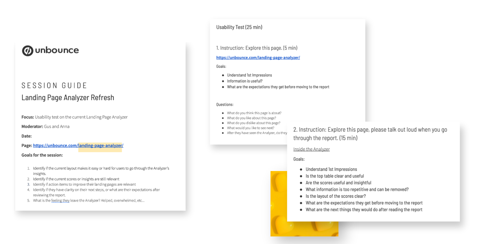
Findings:
General Impressions
60% of participants responded that they perceived high value in the report.
40% of participants thought the amount of insights were making it boring or confusing.
Usability Impressions
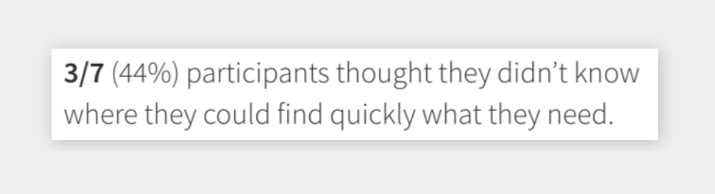
44% of participants thought they didn’t know where they could find quickly what they needed.
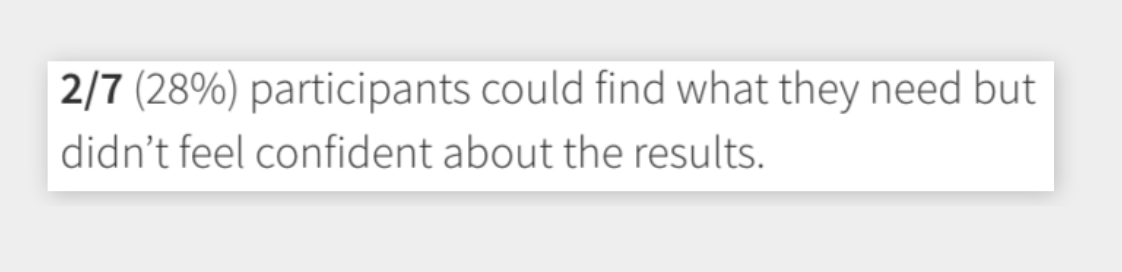
28% of participants could find what they needed but weren’t confident about the results.
28% of participants felt that the report had everything they need and was easy to find.
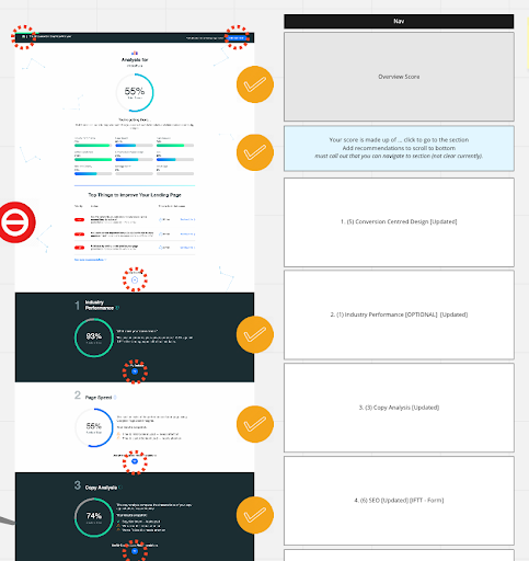
Deep Page and Report structure analysis
Page and Report structure refresh
Challenges:
•Limited visual design considering time/resources
•The database update requires A LOT of dev work
•We need to make sure we don’t lose any traffic
Solutions:
•Working in sprints we could make it happen
•We did user research to make sure we are in the right direction
•The design would be better organized and objective
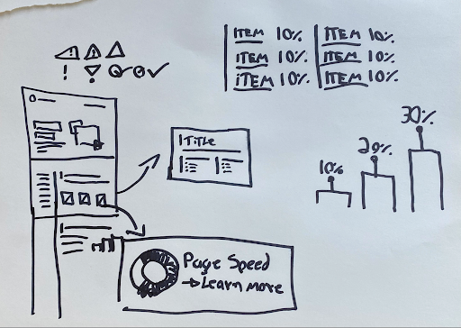
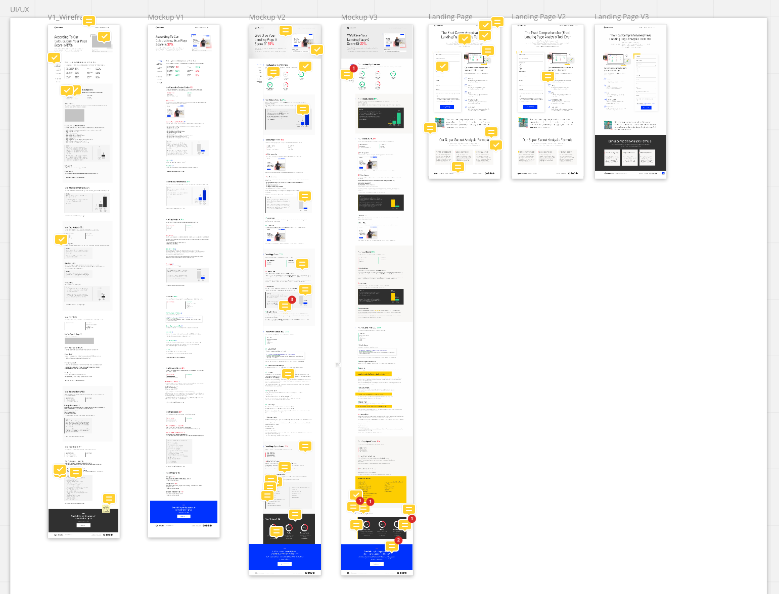
Wireframes - Hand drawn + Figma
Mockups - Figma
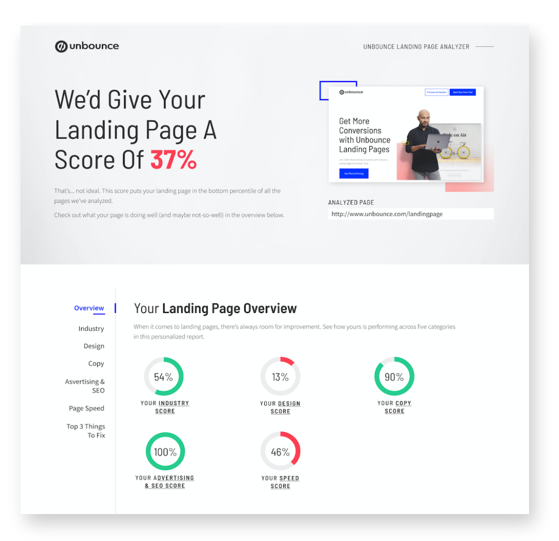
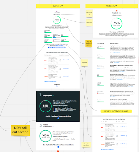
Problem Solved #1
Solutions:
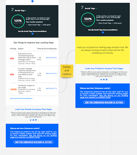
•We removed inaccurate and irrelevant sections according to the research results
•Reorganized sections according to the most interesting results
•Changed collapsible sections to fixed sections to avoid hiding relevant results
•Implemented a sidebar menu for easy navigation
•Initial overview to help the users go to the right section
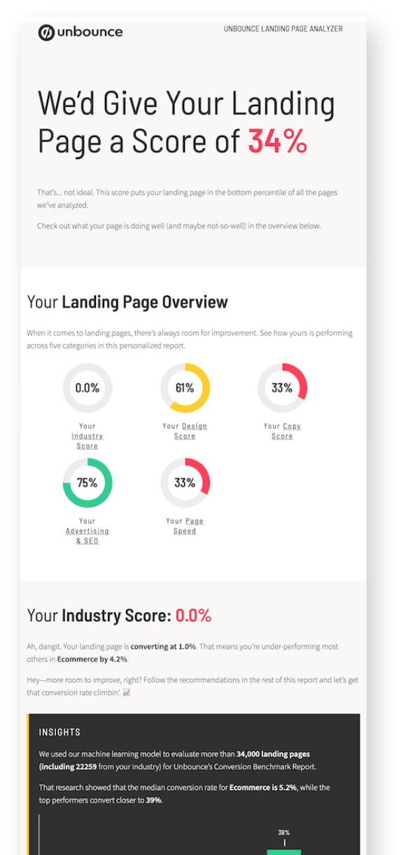
Problem Solved #2
Solutions:
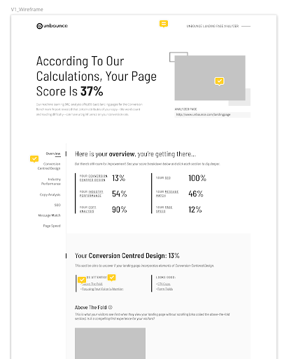
•We included dynamic text on the copy results
•The report shows a screenshot and URL of the page being analyzed to show it’s tailor-made
•We explain multiple times in a digestible way where the data is coming from

See the Landing Page Analyzer full report:
Click here to access
Click here to access
Learnings and Results
Results:
•We increased 23% our monthly unique visitors
•We increased 3.5% of the page conversions
•Despite the difficulties along the way, we finished it on time (4 weeks)
Learnings:
•Sometimes a quick refresh is not that quick and easy
•Our users love data but too much can be boring/busy